
Natalie Comics interviewed Kentaro Miura for his new upcoming series Duranki [a summary here on mangahelpers.com]. Given how his assistants will be trained creating this new series, I will take a look at the recent changes in the art style of Berserk and analyze it from an artist’s perspective.
We are going to start by taking a look at previous arcs.
Construction and Perspective
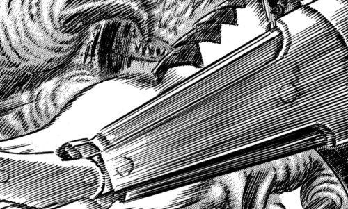
Just getting the construction of Miura’s characters right takes ages, e.g. the bumps and notches in the dragon slayer, the fine details in armor, all the belts and buckles. Miura draws with such accuracy it can easily be considered technical drawing – y’know, the kind of drawings engineers need when they want to manufacture precision parts. Miura has been doing it all manually in MANGA FORM. This goes to to everyone who claims he’s been too “lazy” to draw: please shut up already.

The Movie Trilogy Art book gives us an insight on how clean his base sketches must look like. There are a couple of drawings towards the end of the artbook that appear to be drawings created by Miura, or at the very least, imitations of Miura’s work, created with very similar techniques.
One of these sketches you can actually find as fully inked page in the manga.


Even if the drawings above aren’t the exact same (the faces are different), or are just re-drawn by other artists (or even Miura himself) for marketing purposes; you can still see what effort goes into just layering these drawings properly. I have tried this with traditional means as well and it is very time consuming just to get look right.
Even if these drawings were not drawn by Kentaro Miura, you can still tell that for someone to achieve this level of detail, you HAVE to split up the scenes in your panels into different layers, draw these in full detail, and then put each layer back together when you go for the final ink job.
Accuracy and Clarity
During Lost Children, Miura still struggled with clean lines: e.g. you could see the spot where the pen first touches the paper in his action lines and the line art looks slightly messy. I suppose this messy-ness happened to fit the mood of the arc.


However, Miura in his perfectionism would tackle the messy line art “problem” later to the point we see ultra clean line art during the Sea God chapters. I think that’s also the reason why these chapters were released with the longest hiatus between.

From my own experience with drawing, I’m under the impression that Guts’ Berserker Armor is easier to draw than his Conviction Armor, because Berserker Armor does not have all the notches, knives, belts, details on the belts, etc., which all take time-consuming measuring to draw with precision. Berserker Armor is pretty genius in design given it directly lays on basic human anatomy and Guts’ facial features. It makes it fun, (relatively) quick to draw and badass-looking at the same time. While Berserker Armor is somewhat easier to construct, it takes much more time to shade.
Assistants taking over
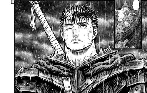
From chapter 340 and onwards I was already under the impression that while we still have Miura’s accurate construction, something felt off. It didn’t feel like Miura’s previous work: normally, you can “see” the artist’s imprint in the drawing they create. When you do a collaboration (something I have done creating colored Berserk pages) that imprint is being “sullied” with someone else’s.
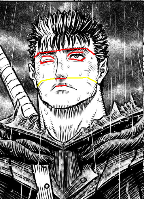
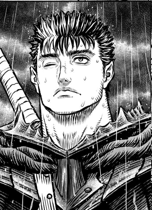
This is what I SUSPECTED what happened from around when episode 352 came out. Guts look really weird in those chapters, the shading especially around his cheekbone looks almost misplaced. It didn’t feel like Miura’s kind of shading at all, as if someone else shaded it instead.
In fact, in the interview by Natalie Comics, Miura states he has switched to digital fully in 2015, which should be around volume 38. This is also where the art style started to change, and it appears like his assistants have been doing more and more work on the pages from this point onward.
Here, I posted on my tumblr about why he looks weird a while ago, and it is solely because of the “misplaced” shading. If you remove the faulty shading, he still looks the same as ever.
After the latest interview on Natalie Comics (a translated summary here), Miura is stating his assistants are shading and toning his art instead, that should allow him to focus on construction, panel layouting, and planning of the plot. That only confirms this impression I had back then.
Reuse of Drawings in the Newest Chapters
Episode 359 was by far the simplest chapter background-wise as well. The use of different perspectives also came a little short: The long shots mostly use the same perspective, possibly to reuse drawn assets (e.g. tree crowns, tree trunks) to increase production speed.


In the above images, we see how the same tree is being reused in three different panels.

I don’t think this is bad in itself as long as it’s not being overused – personally I’m only slightly bothered by it, but only because it’s a change compared to the previous arcs. At the same time I think Miura should have done this waaay earlier.
Also noteworthy in this context is that Guts appears to purposefully be either only partially shown, or hidden behind his cape. I believe that is in part to make him more mysterious, the other part is to speed up production: Berserker Armor still takes a lot of time to draw and I doubt his assistants are good enough to shade it quickly enough.
I also remember doing something like this when I created my fancomic: I purposefully ditched a couple of panels to get it done in the first place, instead of going with perspectives or visualizations that I noticed I struggled with.
By the looks of it Kentaro Miura still doing all the construction and lets his assistants shade or tone it, which seems to be why Guts looks so weird on arriving in Elfhelm. The fact his assistants have been shading his work explains a lot.
Duranki vs Berserk
We can tell from the interview that Duranki is meant to train his current assistants for upcoming Berserk chapters.
The first few chapters of Duranki appear to feature strong nature and forest themes, that strike some resemblance to Berserk’s Elfhelm setting.


The tone of Duranki appears to be rather light-hearted and cute (on that note, Miura really seems to like dogs, too). So far, there are no darker themes explored in Duranki, which has me wondering how that works out with Miura stating something surprising and potentially bad is about to happen in the next couple of Berserk chapters. Either way, I am very interested in how this experiment of his turns out.
Thank you for reading. Let me know what you think about this topic in the comments section below!
If you enjoyed this article, consider getting the book for more!

I know Miura’s work is so detailed; but this post is a very deep review on (for me) unnoticed special details that give to berserk is best. Good post.
LikeLiked by 1 person
Thank you! I’m glad you found this post helpful!
LikeLike
Miura should do a remastered version of Berserk digitally starting from the first volume.
LikeLiked by 1 person
Oh god, that would be an epic feat to accomplish. Berserk has around ~8800 pages in total, so redoing them all will possibly take another 30 years… I’d rather have Miura focus on finishing the series to be honest.
LikeLike
Doesn’t need to be Miura doing all the work.
With the right amount of budget and personnel it is possible, in the future.
LikeLike
Thanks, for me the weirdest drawings were those of Casca in the last chapters…
LikeLike